The colors we wear don't just complement our complexion or reflect current trends—they communicate messages, influence perceptions, and can even affect our own mood and behavior. Understanding color psychology allows you to harness the power of color in your wardrobe for specific purposes, whether you're dressing for a job interview, a first date, or simply want to boost your mood on a difficult day.
How Color Affects Perception
Color is one of the first elements people notice about your appearance, and it creates immediate impressions before you've even spoken a word. Research in color psychology has shown that these impressions are remarkably consistent across cultures, though there are some cultural variations in specific associations. When you choose what to wear, you're not just selecting something that looks good—you're sending nonverbal cues that others subconsciously interpret.
These impressions can affect:
- How approachable you seem
- Perceptions of your competence and authority
- Assumptions about your personality traits
- The likelihood of certain social interactions
- Your memorability in professional and social settings
Understanding the relationships between colors can help you create more intentional outfits.
The Psychological Impact of Key Colors
Red: Power and Passion
Red is perhaps the most psychologically stimulating color. It increases heart rate, breathing, and metabolism, creating a sense of urgency and excitement. In fashion:
- Wear red when: You want to stand out, appear confident, or create a strong first impression.
- Effect on others: Studies show that wearing red can make you appear more attractive and dominant.
- Effect on wearer: Can boost confidence but may also increase stress levels in high-pressure situations.
- Best uses: Date nights, presentations where you want to command attention, social events where you want to be memorable.
- Caution: Can be overwhelming in conservative settings or when you want to create a collaborative rather than competitive atmosphere.
Blue: Trust and Competence
Blue is consistently rated as the most popular color globally and has strong associations with reliability, calmness, and competence. In fashion:
- Wear blue when: You want to convey trustworthiness, stability, and professionalism.
- Effect on others: Creates an impression of dependability and intelligence.
- Effect on wearer: Can lower blood pressure and heart rate, creating a sense of calm.
- Best uses: Job interviews, client meetings, situations where building trust is essential.
- Caution: Very dark blues can sometimes appear aloof or unapproachable if not balanced with warmer elements.
Yellow: Optimism and Energy
Yellow is the most visible color to the human eye and associated with optimism, warmth, and mental stimulation. In fashion:
- Wear yellow when: You want to appear approachable, creative, or youthful.
- Effect on others: Creates perceptions of friendliness and innovation.
- Effect on wearer: Can boost mood and energy levels.
- Best uses: Creative meetings, social gatherings, times when you need a mood boost.
- Caution: Some shades can wash out certain skin tones, and it may be perceived as too casual for formal business settings.
Green: Balance and Growth
Green sits in the middle of the color spectrum and creates a sense of balance and harmony. It's associated with nature, growth, and restoration. In fashion:
- Wear green when: You want to appear balanced, growth-oriented, or when mediating between parties.
- Effect on others: Creates impressions of balance, growth mindset, and approachability.
- Effect on wearer: Can reduce anxiety and create feelings of renewal.
- Best uses: Negotiations, teambuilding events, networking opportunities.
- Caution: Some yellowish greens can create associations with illness if they don't complement your skin tone.
Purple: Creativity and Luxury
Historically associated with royalty due to the rarity of purple dye, purple continues to convey creativity, wisdom, and luxury. In fashion:
- Wear purple when: You want to highlight creative thinking, wisdom, or a unique perspective.
- Effect on others: Creates impressions of uniqueness, creativity, and sometimes spirituality.
- Effect on wearer: Can stimulate problem-solving abilities and creative thinking.
- Best uses: Creative presentations, thought leadership events, artistic settings.
- Caution: May be perceived as unconventional in very traditional settings.
Strategic color combinations can amplify the psychological impact of your outfit.
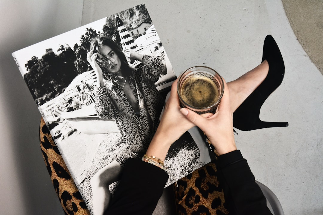
Black: Authority and Sophistication
Black is associated with power, elegance, and authority. It's slimming, sophisticated, and creates clear boundaries. In fashion:
- Wear black when: You want to convey authority, sophistication, or create a slimming effect.
- Effect on others: Creates impressions of competence, authority, and sometimes exclusivity.
- Effect on wearer: Can create a psychological "armor" and increase feelings of confidence.
- Best uses: High-stakes professional settings, formal events, situations where you need to establish authority.
- Caution: Can create a barrier effect, making you seem less approachable in casual or collaborative settings.
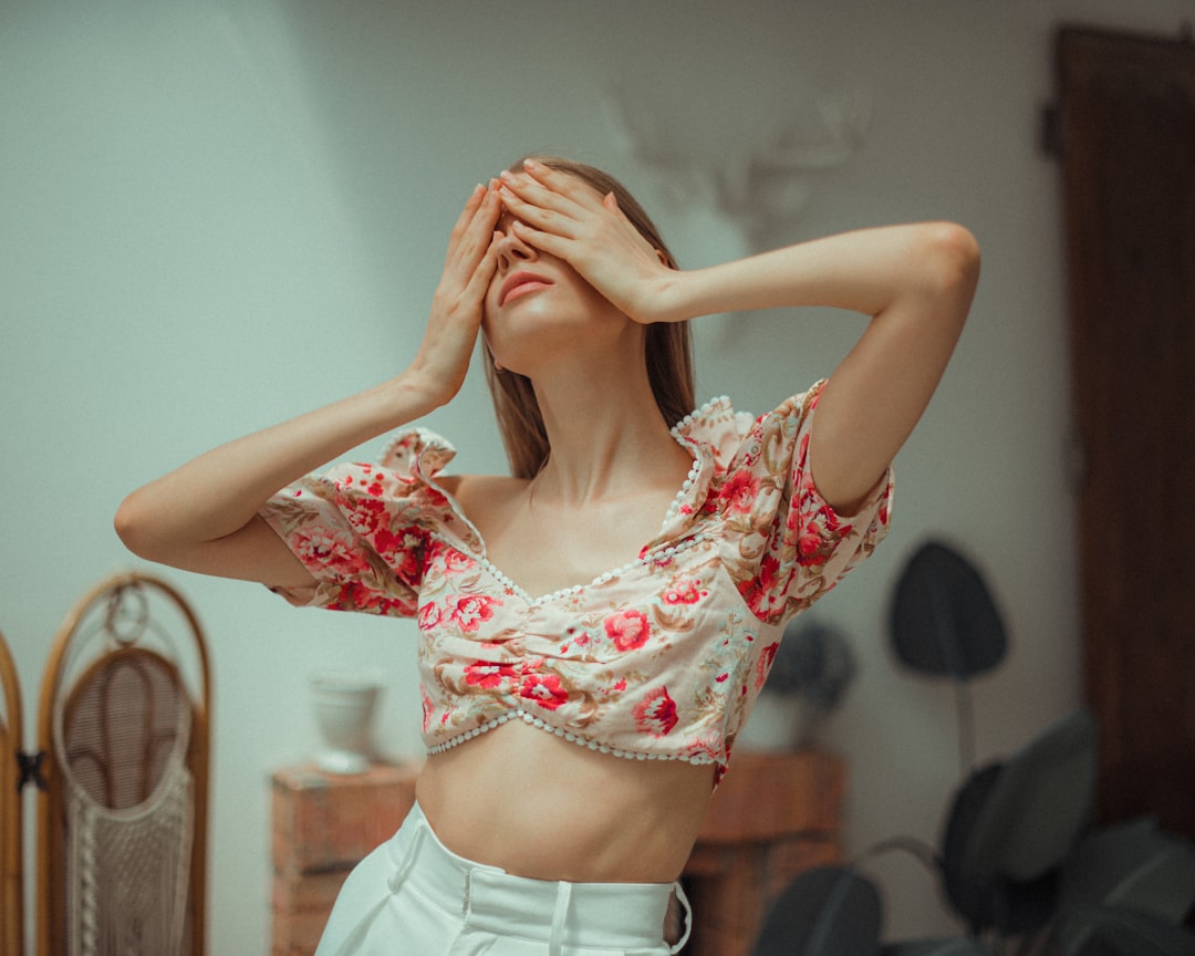
White: Purity and Simplicity
White conveys simplicity, cleanliness, and fresh starts. It reflects all light, creating a sense of space and openness. In fashion:
- Wear white when: You want to appear organized, pure, or create a sense of spaciousness.
- Effect on others: Creates impressions of clarity, simplicity, and sometimes perfectionism.
- Effect on wearer: Can create a sense of cleanliness and order.
- Best uses: Summer events, minimalist aesthetics, when you want to communicate clarity of purpose.
- Caution: Requires more maintenance than darker colors and can create a sense of distance.
Strategic Color Combinations
The psychological impact of colors can be amplified or moderated by how they're combined:
Monochromatic
Using varying shades and tints of a single color creates a sophisticated, cohesive look that amplifies the psychological effects of that color. A monochromatic blue outfit, for instance, strongly reinforces perceptions of trustworthiness and competence.
Complementary
Pairing colors from opposite sides of the color wheel (like blue and orange or purple and yellow) creates visual impact and energy. This combination is attention-grabbing but should be used strategically when you want to be noticed.
Analogous
Using colors adjacent to each other on the color wheel (like blue, blue-green, and green) creates harmony and sophistication. This approach is less dramatic than complementary combinations but creates a polished, intentional appearance.
Accent Colors
Using a small pop of a psychologically impactful color against a neutral background allows you to harness the color's effect without overwhelming your look. A primarily navy outfit with red accessories strategically combines trustworthiness with touches of confidence and energy.
Practical Applications for Different Settings
Professional Settings
In most professional environments, strategic color choices can influence how your contributions are perceived:
- Job interviews: Navy blue conveys trustworthiness and competence—ideal for making a strong first impression.
- Presentations: Add red elements when you need to command attention and appear authoritative.
- Team collaboration: Green promotes balance and can position you as a mediator.
- Client meetings: Blue builds trust, while touches of purple can suggest creative problem-solving abilities.
Social Settings
Color choices in social environments can influence interactions:
- First dates: Red increases perceived attractiveness, while blue creates trust.
- Group gatherings: Yellow promotes sociability and approachability.
- Making new connections: Purple's uniqueness makes you memorable in networking situations.
Self-Care Through Color
You can also use color to influence your own psychological state:
- For energy: Wear red, orange, or yellow when you need a boost.
- For calm: Choose blue or green when feeling stressed.
- For confidence: Black or red can create a psychological armor before challenging situations.
- For creativity: Purple and blue-green can stimulate innovative thinking.
Personal Color Analysis: Finding Your Most Impactful Palette
While understanding color psychology is valuable, it's equally important to recognize which colors work best with your natural coloring. Personal color analysis identifies colors that harmonize with your skin tone, eye color, and hair color, allowing you to harness color psychology most effectively.
The most flattering colors for you will:
- Make your skin appear clearer and more vibrant
- Enhance your natural features rather than overwhelming them
- Create a sense of harmony between your clothing and your appearance
When you wear colors that naturally complement you, the psychological impact is enhanced because you appear more healthy, vibrant, and confident. A professional color analysis can identify your optimal palette, but general guidelines include:
- Warm skin tones: Typically look best in colors with yellow or gold undertones.
- Cool skin tones: Usually harmonize with colors that have blue or pink undertones.
- High contrast features: Can often wear bold, clear colors effectively.
- Low contrast features: Often look most harmonious in softer, more muted tones.
Color is one of the most powerful tools in your styling arsenal. By understanding both the psychological impact of different colors and which ones naturally enhance your appearance, you can make intentional choices that influence how you're perceived and how you feel. Whether you're dressing to impress others or simply to boost your own mood, strategic color selection can help you achieve your goals with subtle yet significant impact.